Redesigning and Structuring Enterprise Product Pages at AnyDesk
I worked on restructuring 16 existing product pages and designing 2 new layouts for upcoming products. My focus was improving hierarchy, trust positioning, and decision flow for enterprise users.
Click to jump to sections
Client
Anydesk.com
Role
UX Researcher, UXDesigner (Structural Redesign & Layout Strategy)
Timeframe
Q3 - Q4 2025
Project Overview
I worked on restructuring multiple product pages (16), defining new layouts, clarifying messaging, and creating implementation-ready design guidance for the UI team.
The pages had strong content, but many of them were hard to scan, text-heavy, and not structured around enterprise decision-making.
My focus was not visual redesign alone. It was improving hierarchy, section flow, and trust positioning to better support decision-making.
Rather than focusing only on visual polish, I aligned each page’s structure with its core intent. By prioritizing relevant sections and reducing distractions, I improved clarity, engagement, and overall conversion readiness.
This project required research, architectural thinking, cross-team collaboration, and validation before UI execution.
Goal
My focus was not visual redesign alone. It was improving hierarchy, clarity, and trust positioning for enterprise users evaluating remote access solutions.
I worked on restructuring multiple product pages, defining new layouts, clarifying messaging, and creating implementation-ready design guidance for the UI team.
Problem
After auditing the pages, I found several recurring issues, some of them are:
- Too much text with long paragraphs
- Some contents not directly aligned with page intent
- Repeated CTA across the page
- Trust and security signals were missing or not positioned strategically
- Important information placed too far down the page
- Mixed use cases without clear grouping
- Content blocks were present, but not structured for decision making
- Low visual contrast in some sections
- Inconsistent layout patterns across pages
These issues made the pages feel overwhelming and harder to navigate, especially for enterprise users who scan quickly.
What I Improved
Instead of focusing only on visuals, I improved structural clarity and decision flow.
- Reduced text density
- Redesigned layout into structured section to make it easily scannable and user friendly
- Reduced aggressive CTA repetition
- Replaced low-impact blocks with structured use case sections where appropriate
- Reordered sections to match user evaluation flow
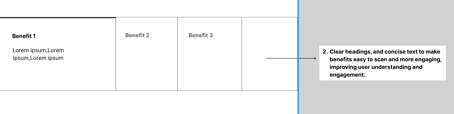
- Improved heading clarity
- Removed unnecessary repetition in pages
- Added and improved trust placement (security badges and certifications)
- Created clearer use-case grouping
- Improved contrast and visual hierarchy
Expected Impact
📊 Clearer hierarchy for enterprise buyers
🛡️ Stronger trust positioning
📈 Improved page flow, increasing engagement and reducing drop-off
💡 Better feature comprehension
🎯 More consistent brand structure
My Role
I worked across research, structure, and validation.
- Conducted UX research and competitor analysis
- Created wireframes and structural layout concepts
- Documented why each section should exist and its impact
- Defined redesign strategy based on content gaps and hierarchy issues
- Collaborated with senior designer and content team
- Designed layouts for 2 new product landing pages
- Supported UX marketing initiatives (SOC2 badge placement, LinkedIn QR integration)
- Performed UAT on multiple pre-live and landing pages
- Created Mood board and layout guidance for UI designer
- Built interactive prototypes to validate flows
My Work process
🔍 Audit Existing Page
🧩 Identify Issues
📊 Competitor Research
✏️ Redesign Layout
📝 Document Before vs After with reasoning
🎨 Mood Board & UI Direction
Research & Strategy
I extensively researched 8+ competitors websites and studied how collaboration and enterprise SaaS companies structure trust, feature explanations, and decision triggers.
Competitors


I focused on:
- Analyzing how enterprise websites prioritize content differently based on each page’s goal and user intent.
- How enterprise CTAs are structured
- How features are sequenced
- How trust is positioned
- Where compliance is placed
- Animation usage
Then I documented why certain layouts work in high-trust industries ->
Intentionally blurred due to confidentiality ->
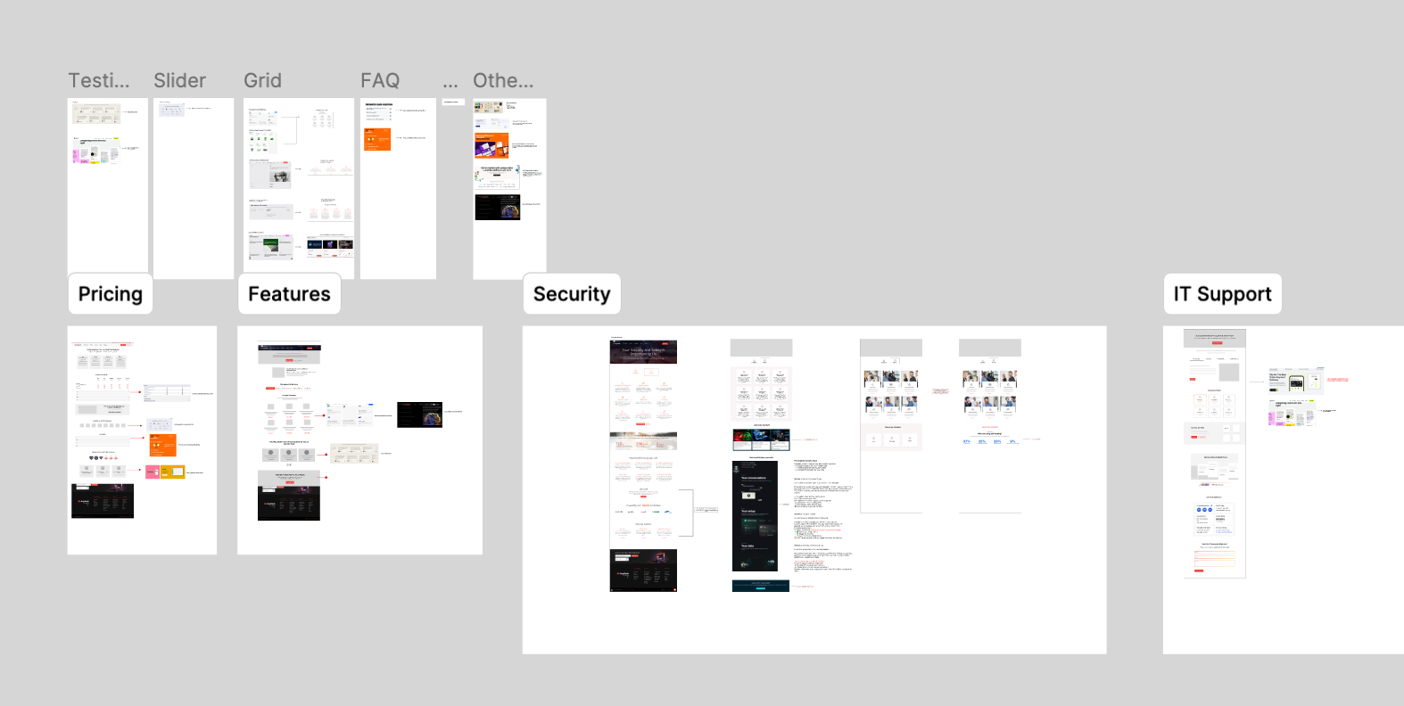
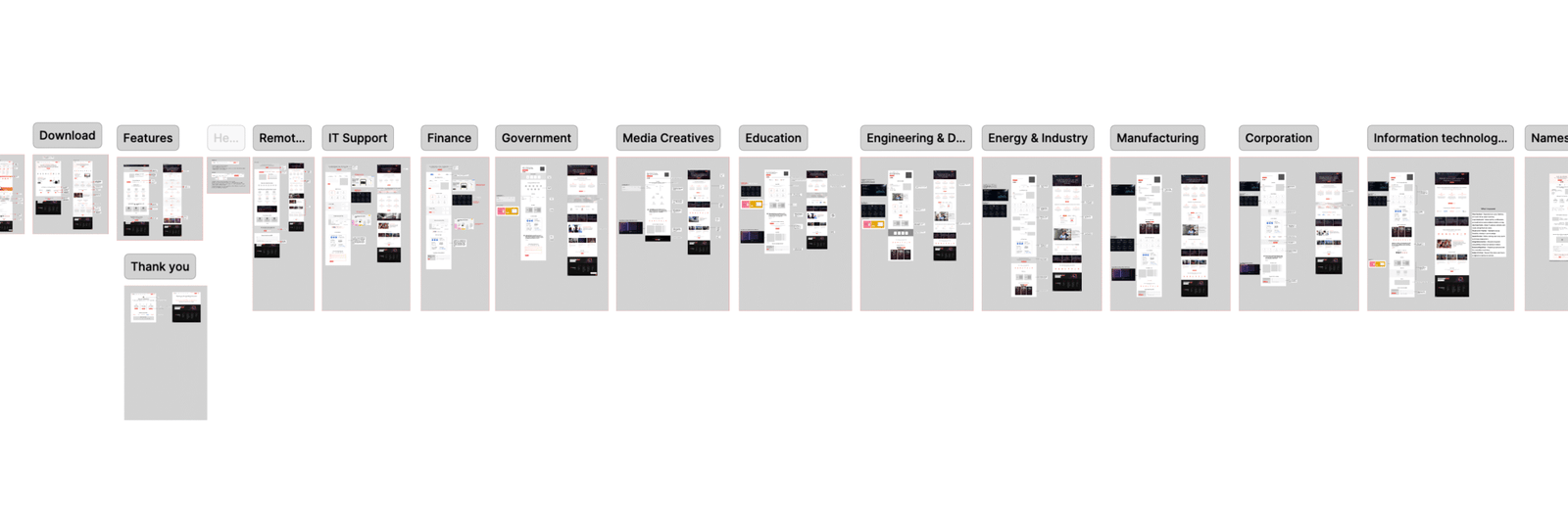
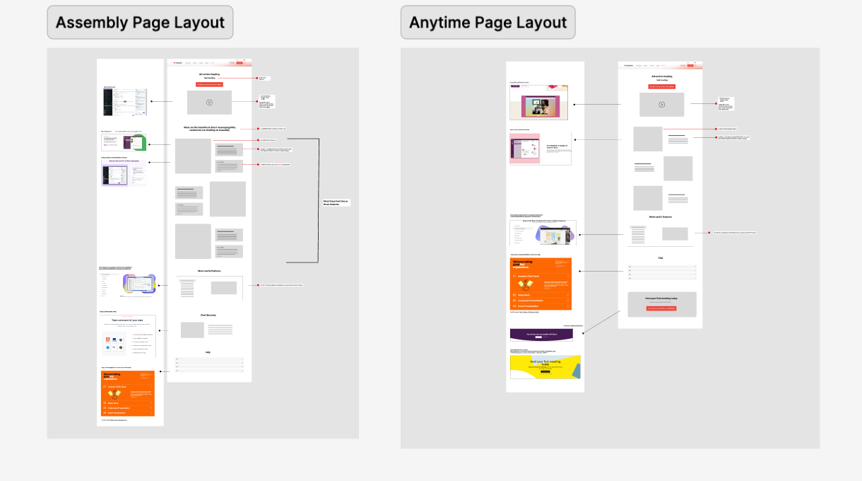
Redesigning 16 Existing Pages
After research, I redesigned the layout structure for 16 pages.
Instead of jumping into visual design, I worked on layout architecture first. For each page, I followed a consistent process:
- Defined the page intent
- Listed structural problems in the existing version
- Created a new layout structure in Figma
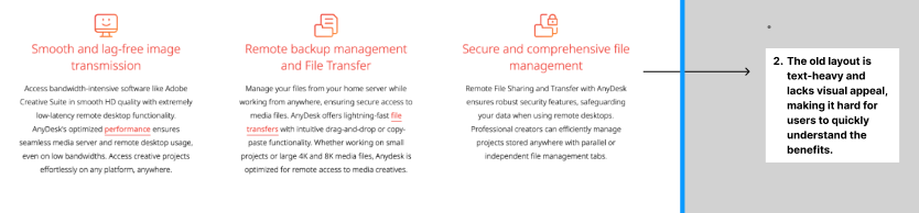
- Documented “before” issues directly inside the layout file
- In each redesign layout included notes explaining what was improved and why
Intentionally blurred due to confidentiality ->

Example
Designing 2 New Product Layouts
For two upcoming product pages, I designed full layout concepts from scratch.
These layouts were structured to:
- Visual tone suitable for enterprise users
- Present features in logical order
- Introduce trust elements and use cases at the right stage
- Guide users naturally toward action
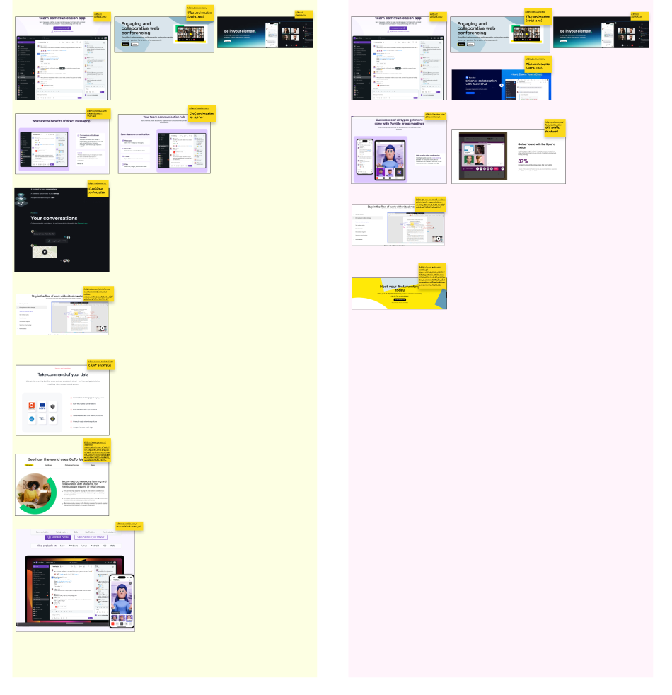
Mood Board & UI Direction
To support the final UI execution, I created mood boards and collected UI inspiration references.
- Visual tone suitable for enterprise users
- UI patterns aligned with modern SaaS standards
- Clean spacing and typography direction
- Consistent layout rhythm
- Industry standard user friendly design
Intentionally blurred due to confidentiality ->

Personal Design and Prototype Exploration
Separately, I created an interactive prototype as a personal practice project.
This was not part of the official redesign. It was a self-initiated exercise to explore visual refinement and interaction flow.
Tools: I used Figma to design and prototype it