Streamlined checkout by improving order details, button clarity, and adding a confirmation page.
Click to jump to sections
Client
Puma UK
Role
UX Researcher, Designer
Timeframe
Q3 2024
Services
UX Research, UX Design, User Interview
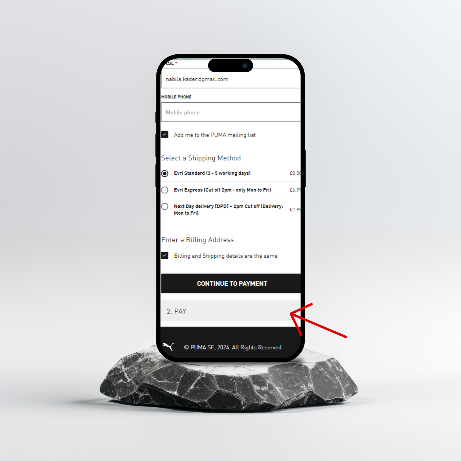
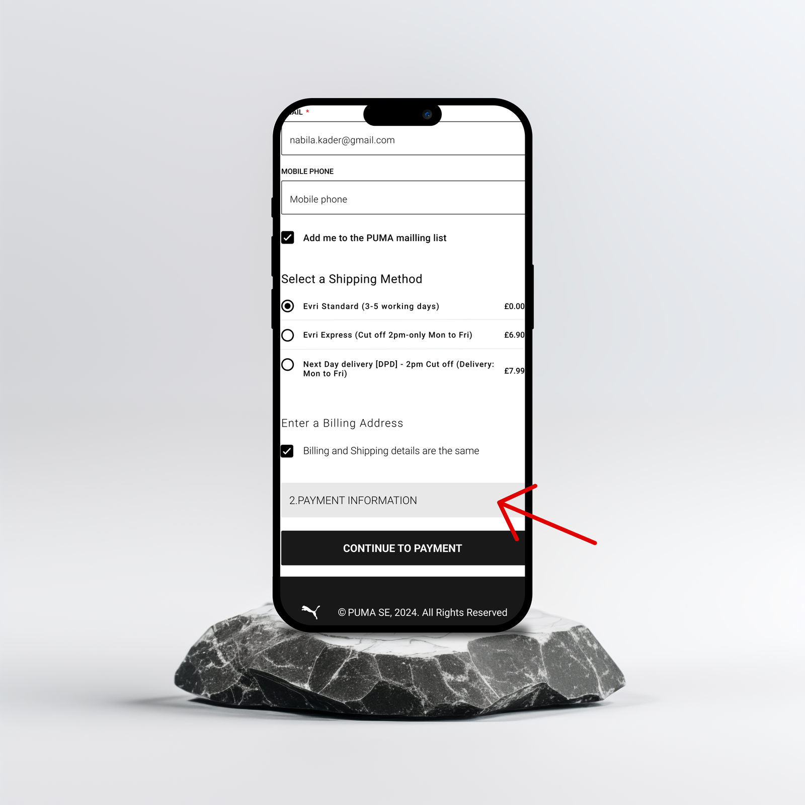
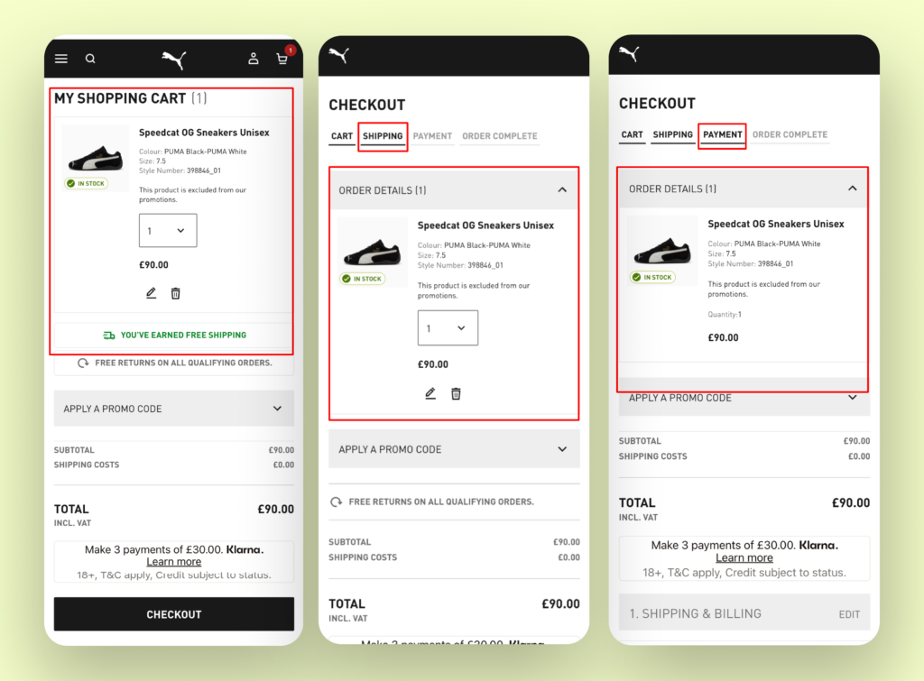
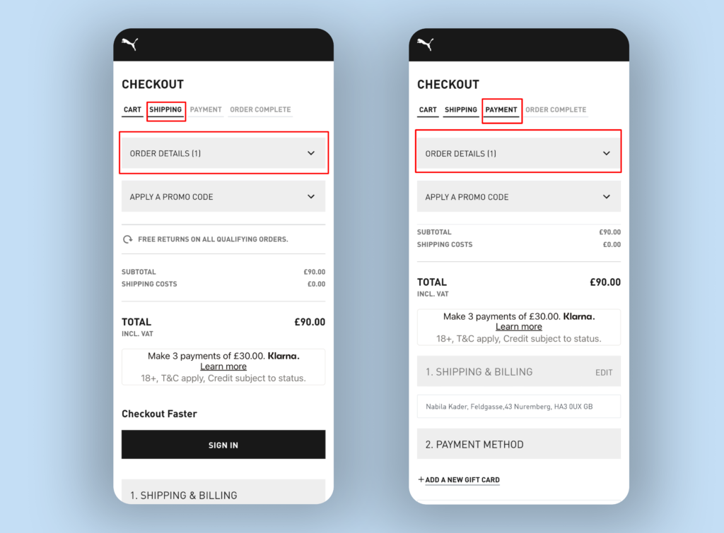
Puma UK faced a significant challenge with high drop-off rates during the mobile checkout process. My role was to evaluate the checkout experience, identify key pain points, and recommend actionable improvements to streamline navigation and increase conversion rates.
The PUMA UK mobile checkout process had a high drop-off rate, indicating user frustration and missed conversion opportunities. Key issues included:
A redesigned checkout flow that:
⏱ -15%
Checkout Completion Time
🌟 +30%
Customer Satisfaction Score (CSAT)
🔍 +25%
First-Attempt Success in Finding Payment Options
💰 +Projected $15M
Est. Annual Revenue Impact
The “2.PAY” text in the checkout process confused users because its purpose was unclear and often mistaken for a clickable button. This misunderstanding caused hesitation and disrupted the flow of completing their payment.
I replaced the “2.PAY” text with clearer wording, moving it to the top of the section and placing the button at the bottom. This follows common design patterns where users expect to click buttons placed at the bottom.
“I think it’s a little bit confusing,
i don’t think it should be there” – Emma
“I don’t know what that means” – Chris
Users found the repeated order details at the top of every page unnecessary and time-consuming, slowing down the checkout process.
I simplified the checkout flow by keeping the order details accordion open only on the Cart page, closed by default on other pages, and adding a clear confirmation page at the end.
“I’d condense this part of the page, I have already seen my basket” – Emma
“Having to scroll down each time is a little bit frustrating” – Ed
“I’d like to see a page showing all my order details before placing the order” – Farouq
Discover
User Interview
Define
Design
Test
Deliver
Through comprehensive UX research, Competitive analysis and user interviews, I identified key pain points in the PUMA UK checkout process. The redesigned checkout flow improves clarity and efficiency:
Before
After
After
These changes are expected to reduce drop-off rates, enhance user satisfaction, and streamline the checkout experience.