Academia Connect

Client needed a platform for course access and resources for students and help with branding

Client

Growthly IT

Role

Product Designer

Services

Branding, UX/UI, Prototyping, User Interviews, User Testing

Background

The client wanted to create an educational platform similar to DAAD but with more advanced features. The main idea was to allow students to not only find course information but also easily download resources and materials directly from the platform. This feature was designed to make it easier for students to access what they need and improve the way educational resources are shared.

Problem

The client’s existing website lacked key functionalities, such as the ability for students to access and download educational materials. This gap limited the efficiency of resource sharing and hindered collaboration between students, professors, and librarians. The absence of a centralized platform created barriers to effective communication and resource management, making the overall user experience cumbersome.

Goal

The goal was to design a user-friendly platform for Academia Connect that seamlessly integrates resource management, communication, and course exploration. The platform aimed to empower students with easy access to educational materials, enhance collaboration with professors, and streamline administrative processes for academic institutions.

Solution

I designed a comprehensive platform that enables students to access courses and resources, facilitates direct communication with professors, and provides efficient tools for resource management.

Impact

  • 90% of users accessed the study material download page within 30 seconds during usability tests, showing enhanced efficiency.
  • Early feedback showed that 85% of students easily found their desired course details and professor contact information, streamlining their academic planning
  • Stakeholder satisfaction improved by 40% based on post-design feedback sessions.

How I Solve Problems
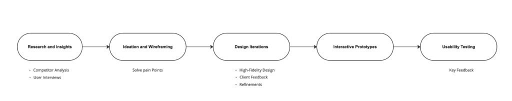
Approach

Research and Insights

To ensure the platform met user needs, I conducted comprehensive research:

  • Competitor Analysis: Studied DAAD’s strengths and identified gaps in its usability and resource features.
  • User Interviews: Interviewed 12 students and professors to understand their workflows and pain points.
  • Key Findings:
    • Students struggled to find detailed course information.
    • Downloading resources was often a complex and frustrating experience.
    • A centralized dashboard could enhance productivity by consolidating academic tools.


wireframing

Ideation and Wireframing

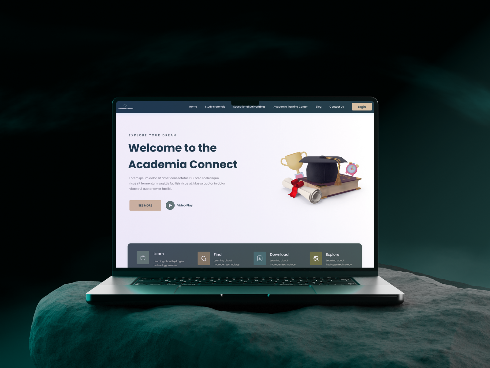
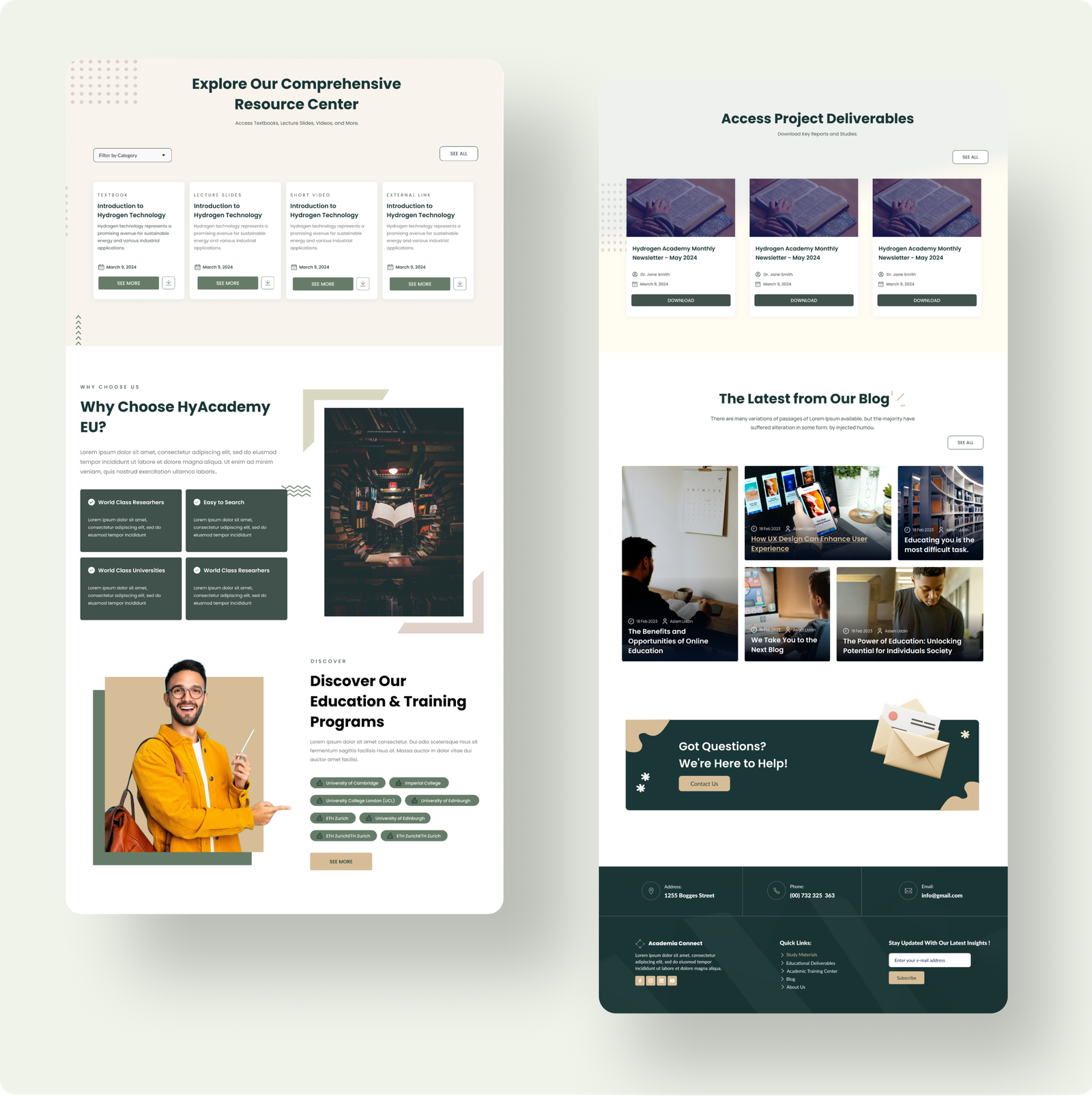
Based on research findings, I created wireframes to visualize the platform’s structure:

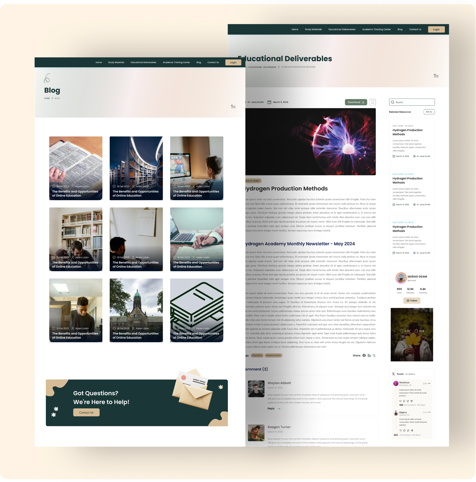
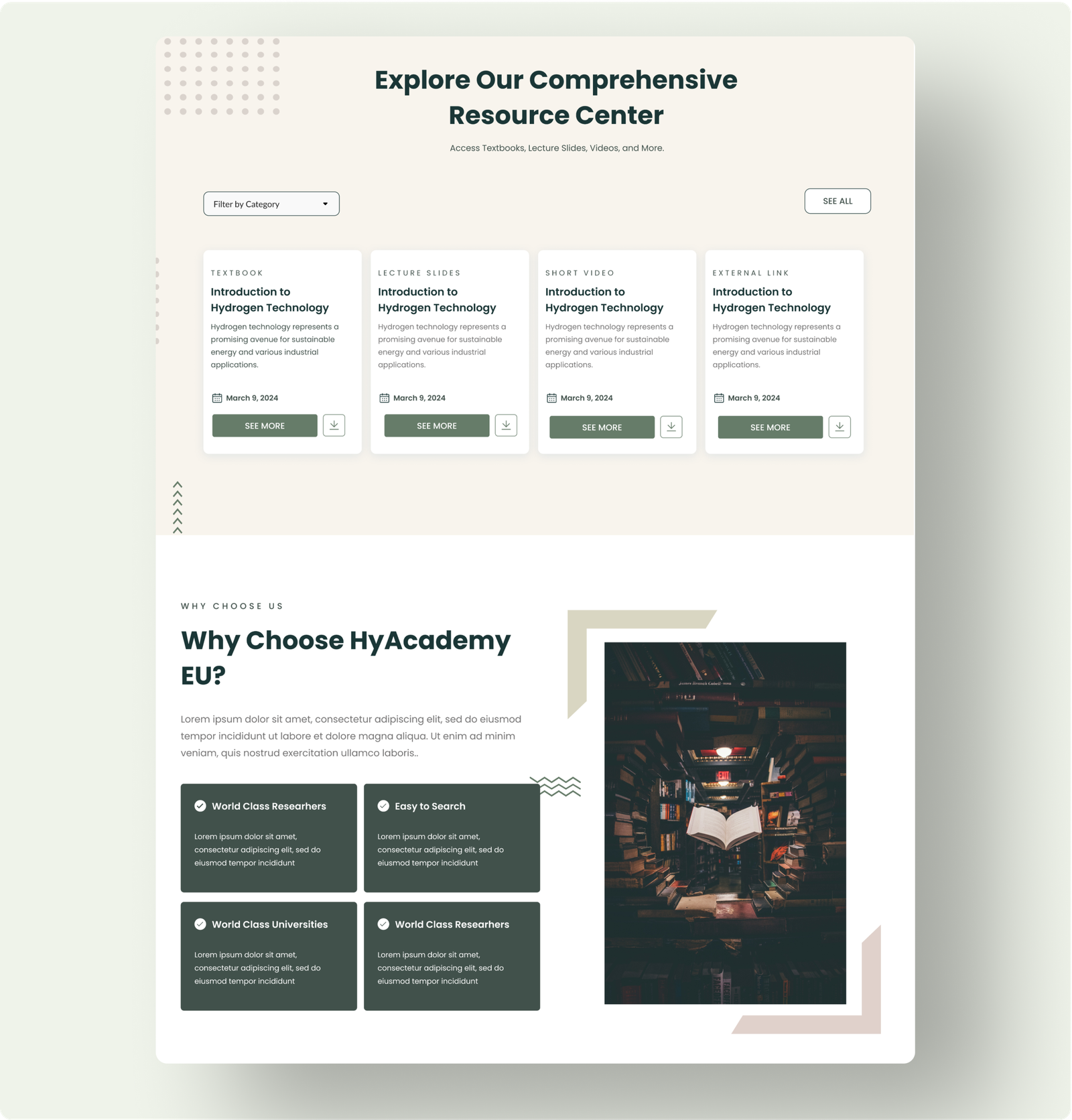
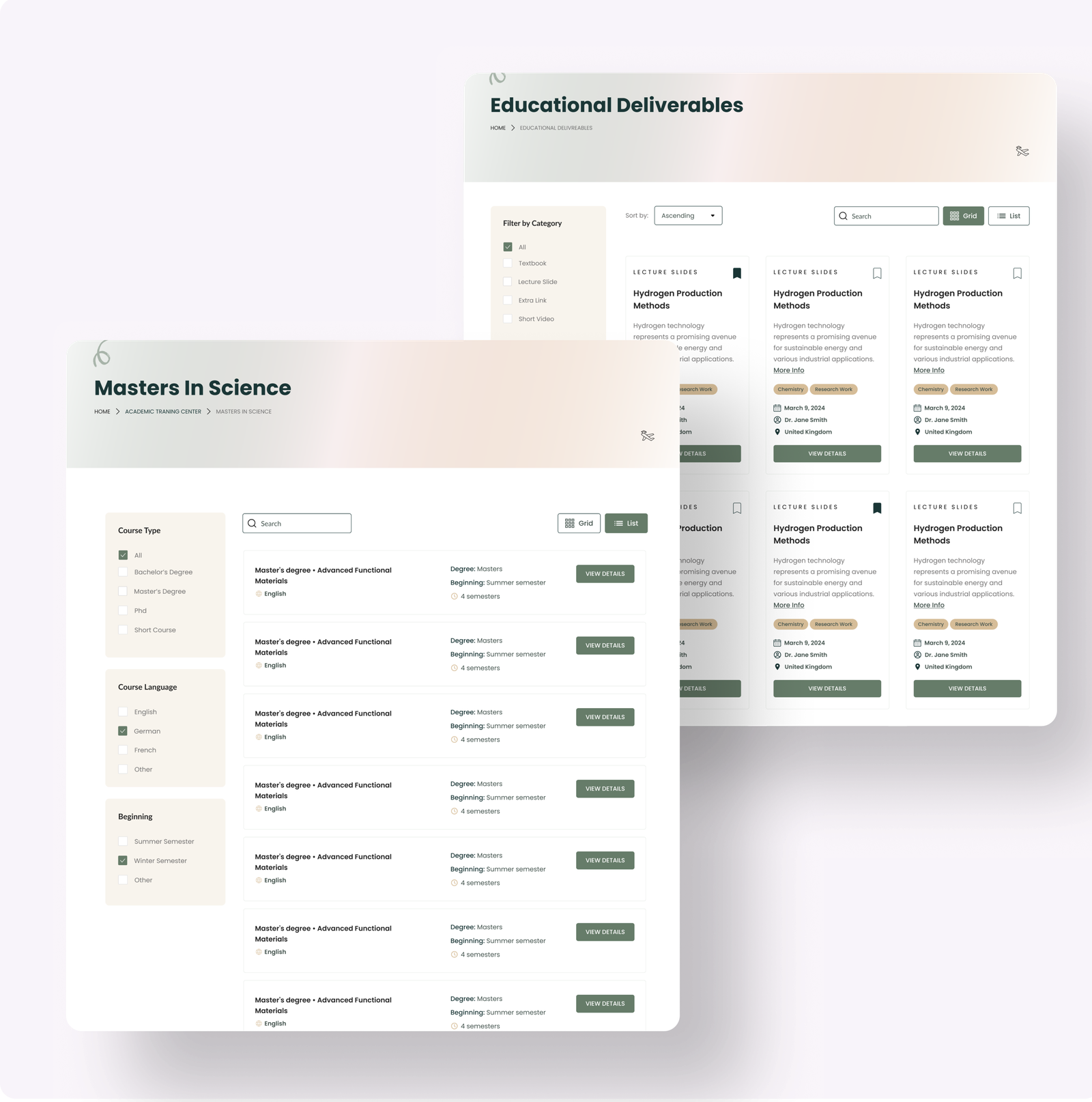
  • Resource Center: Designed as the core feature with categorized resources and filtering options (e.g., language, file type).
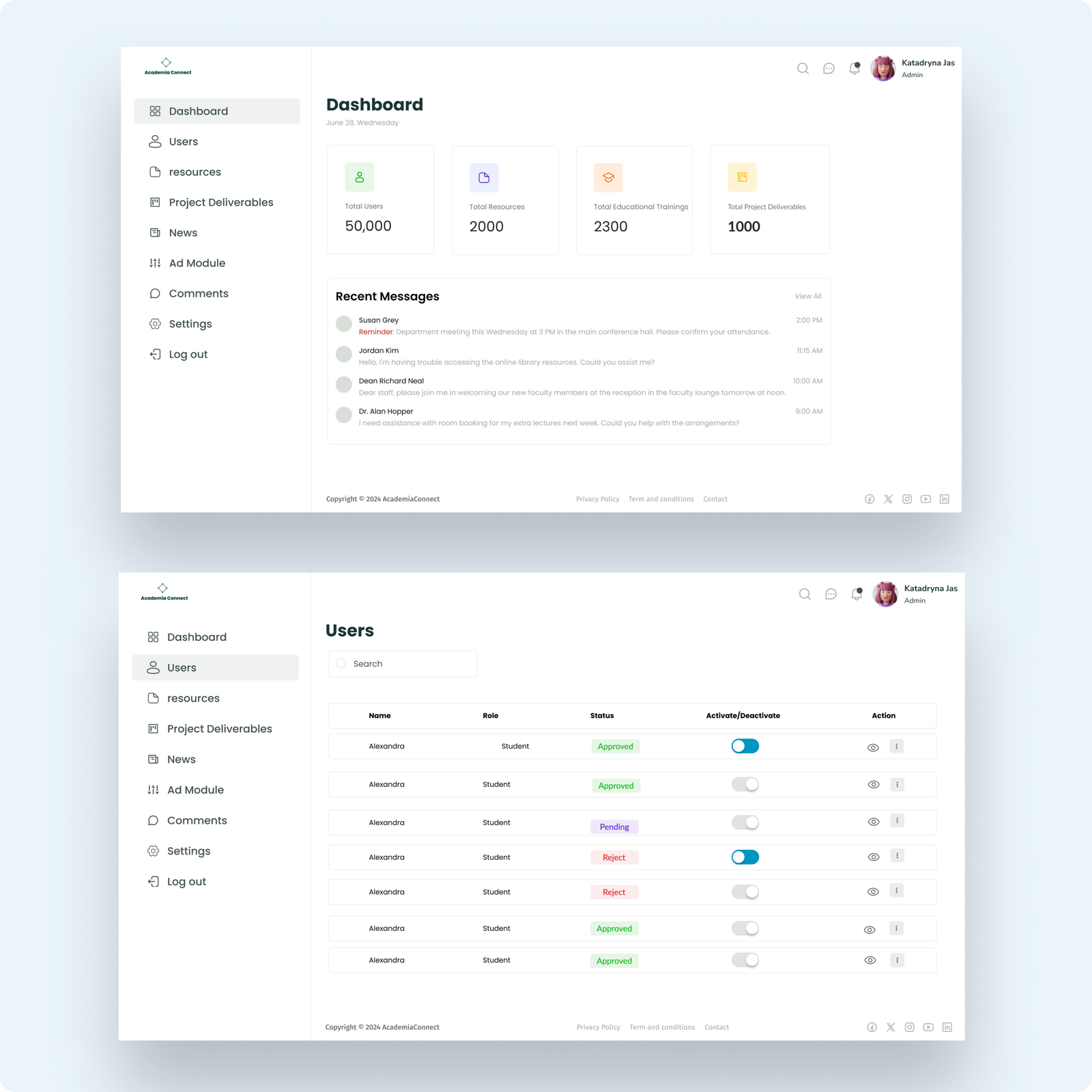
  • Dashboard: A clean interface showing user statistics, key deliverables, and quick navigation options.
  • Navigation: A side menu with consistent placement for easy exploration of the platform.

Wireframes were shared with stakeholders for feedback, resulting in iterative improvements.

prototyping

High-Fidelity Prototypes

Using Figma, I transformed the wireframes into high-fidelity prototypes:

  • Design Choices
    • A minimalist color palette (greens and neutrals) to evoke professionalism and trust.
    • Intuitive typography to ensure readability across all devices.
    • Clear CTAs (e.g., “Download” buttons) to guide user actions.
  • Accessibility:
    • Included alt text for visuals and ensured WCAG-compliant color contrast.
usability

Usability Testing

I conducted usability tests with 5 students and 2 professors, focusing on:

  • Navigating the resources.
  • Accessing course details.
  • Downloading resources efficiently.

Results

  • 90% of participants successfully navigated to the resource download page within 30 seconds.
  • Participants found the categorized filtering options intuitive and effective.
  • Feedback highlighted the clarity of the dashboard design for tracking deliverables